In the modern professional landscape, the home office has evolved from a temporary workspace to a permanent sanctuary of productivity. However, many remote workers focus solely on ergonomic chairs and high-speed internet, overlooking one of the most powerful tools in their arsenal: the color of their walls.
Environmental psychology suggests that the colors surrounding us have a profound impact on our cognitive function, mood, and energy levels. If you’ve been feeling sluggish, distracted, or uninspired, the culprit might not be your workload, it might be your décor. Whether you are looking for a DIY refresh or planning to hire a professional Commercial Painting Service Southampton NY to renovate your executive suite, choosing the right hue is essential.
Here is a detailed guide to six home office paint colors designed to boost productivity and how to choose the right one for your professional needs.
1. Off-White: The “Clean Slate” for Clarity
While stark, hospital-grade white can feel clinical and lead to eye strain, a warm Off-White is a powerhouse for productivity. Off-white acts as a “palate cleanser” for the brain, minimizing visual noise and allowing you to focus entirely on the task at hand.
Why it works: Off-white maximizes the distribution of natural light. For those working in smaller rooms, it creates an illusion of space, preventing that “boxed-in” feeling that leads to mid-afternoon burnout. It is the perfect backdrop for professionals who deal with high-density data or complex problem-solving where mental “clutter” needs to be kept to a minimum.
2. Sage Green: Restorative Focus and Stress Reduction
Green is positioned in the center of the visible light spectrum, making it the easiest color for the human eye to process. Specifically, Sage Green, a muted, earthy tone brings the calming essence of the outdoors into your workspace.
Why it works: Sage green is inherently restorative. If your job involves high-pressure deadlines or intense concentration, this color helps lower cortisol levels and reduces anxiety. It promotes a sense of “quiet alertness,” allowing you to remain focused for longer durations without experiencing the mental fatigue common in more vibrantly colored rooms.
3. Light Blue: The Universal Mind Stimulator
If your work requires repetitive tasks, administrative precision, or deep “mind-mapping,” Light Blue is your best ally. Blue is scientifically linked to increased productivity and is widely considered the most “productive” color across various industries.
Why it works: Light blue has a physiological effect on the body, lowering the heart rate and steadying the breath. This creates a stable environment for the “thinking brain” to operate. It is particularly effective for those who find themselves easily overstimulated or prone to “ping-ponging” between different tasks without finishing them.
4. Muted Yellow: The Spark for Creative Innovation
For those in the creative arts designers, writers, architects, and marketers a Muted Yellow can be the catalyst for your next big idea. Yellow is the color of optimism and ego; it stimulates the nervous system and encourages the flow of ideas.
Why it works: While a bright, neon yellow can cause frustration or even headaches, a soft, “butter” yellow provides a gentle surge of energy. It keeps the “creative spark” alive during long brainstorming sessions. It’s the visual equivalent of a fresh cup of coffee, keeping your mood elevated and your imagination active.
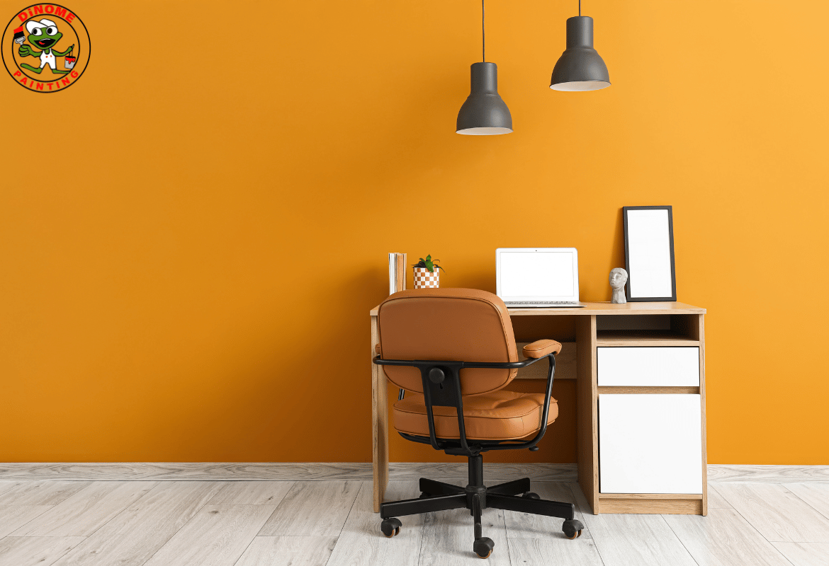
5. Terracotta and Soft Orange: Boosting Social Energy
As the world of work becomes increasingly collaborative, many find themselves spending most of their day on video calls. Terracotta or Soft Orange is an excellent choice for the modern “social” professional.
Why it works: Orange is a color of communication and physical energy. It promotes an active, engaged brain. Unlike red, which can trigger an “alarm” response, terracotta provides a grounded, warm energy that encourages conversation and openness. If your role involves sales, management, or frequent collaboration, this hue ensures you stay energized and approachable.
6. Greige: The Sophisticated Executive Balance
“Greige” the perfect marriage of gray and beige has become the gold standard for modern professional interiors. It offers the sleek, contemporary feel of gray with the inviting warmth of beige, avoiding the “coldness” that often comes with standard neutrals.
Why it works: Greige is the ultimate “no-nonsense” color. It creates a sophisticated environment that signals to your brain that it is time for professional, executive-level work. It provides a balanced backdrop that doesn’t compete with your thoughts or your décor, making it an excellent choice for those who want their office to feel like a high-end corporate suite.
Beyond the Color: Execution and Professional Finish
Choosing the color is only half the struggle; the application and the quality of the paint are what truly define the atmosphere of the room. When transitioning from interior productivity to the overall maintenance of your property, the same attention to detail should be applied.
If your home office is part of a larger estate or commercial property, you may want to consider how your interior choices reflect your exterior brand. For those looking to maintain a pristine professional appearance from the outside in, consulting an Exterior Painter Company Southampton NY can ensure that your property’s curb appeal matches the high-quality environment you’ve built inside.
The Importance of Finish
When applying your chosen productivity color, the “sheen” or finish is critical. For most home offices, an eggshell or satin finish is recommended. These finishes are durable enough to handle the occasional scuff from a desk chair but lack the high-gloss shine that creates distracting glare under desk lamps and computer monitors.
Testing in Your Environment
Before committing to a full room of Exterior Paint or interior pigment, always test a swatch. Light behaves differently depending on the direction your windows face. A Sage Green that looks vibrant in a south-facing room might look muddy in a north-facing room with less natural light.
Conclusion
Your home office should be more than just a place where you sit with a laptop; it should be a curated environment designed to support your specific cognitive needs. By selecting a color based on the psychological demands of your job whether it’s the calming nature of Sage Green or the communicative energy of Terracotta you can create a space that naturally pulls you into a state of “flow.”
If you are ready to overhaul your professional space or require a high-end Commercial Painting Service Southampton NY to bring your vision to life, remember that the right color isn’t just a design choice, it’s a business investment. A fresh coat of paint might be the simplest, most effective way to unlock your full professional potential.