When we think about home renovation, our focus naturally gravitates toward eye-level changes: new furniture, updated flooring, or a fresh coat of paint on the walls. However, interior designers often refer to the ceiling as the “fifth wall,” a massive, unobstructed canvas that holds the power to completely transform the mood, scale, and light of a room.
Whether you are working with Residential Remodeling Contractors Southampton to overhaul your living space or simply looking to refresh a tired bedroom, understanding the nuances of ceiling color is essential. In this guide, we will dive deep into the dos and don’ts of selecting the perfect hue for your overhead space, ensuring your home feels balanced, stylish, and intentional.
Why the Ceiling Matters
For decades, the default choice for ceilings was “Flat White.” While white is a safe and often effective choice, it is not the only option. The color you place above your head dictates how the eye perceives the boundaries of the room. A well-chosen ceiling color can make a cramped room feel airy, a cavernous hall feels intimate, or a bland space feels architecturally significant.
The “Dos” of Choosing Ceiling Paint
1. Consider the Room’s Height and Volume
The height of your ceiling should be the primary driver of your color choice.
- For Low Ceilings: The goal is to “push” the ceiling away. To do this, opt for a color that is one or two shades lighter than your wall color. This creates a vertical gradient that draws the eye upward, making the walls appear taller than they are.
- For High Ceilings: If you are blessed with soaring ceilings, you have the luxury of experimentation. Using a color darker than the walls can “lower” the ceiling visually. This is particularly effective in large, open-concept homes where high ceilings can sometimes feel cold or impersonal. A darker hue brings the “lid” down, creating a cozy, grounded atmosphere.
2. Choose the Right “White”
If you decide to stick with white, remember that “white” isn’t just one color. Whites have undertones pinks, blues, yellows, and grays. If your walls are warm beige, a stark, blue-toned “Cool White” on the ceiling will look clinical and jarring. Always match the temperature of your ceiling white to the temperature of your wall color.
3. Use the “Half-Strength” Rule
One of the most professional tricks in the book is to use the same color as your walls but at a reduced intensity. When you go to the paint store, ask them to mix your wall color at 50% strength for the ceiling. Because ceilings are horizontal and rarely receive direct light, they naturally sit in shadow. The color at full strength on the ceiling will often look darker than it does on the wall. Cutting it by half ensures a harmonious, seamless look that doesn’t overwhelm the space.
4. Accentuate Architectural Details
If your home features tray ceilings, coffered beams, or ornate crown molding, don’t hide them. Use the ceiling paint to create contrast. For example, painting the recessed “tray” of a ceiling a soft charcoal while keeping the surrounding molding a crisp white creates a sophisticated, high-end look. This adds a three-dimensional quality to the room that a monochromatic scheme simply cannot achieve.
5. Always Test with Swatches
Never pick a ceiling color based on a small chip under the fluorescent lights of a hardware store. Paint a large swatch on a piece of poster board and tape it to the ceiling. Observe it at different times of the day morning light, afternoon sun, and under your evening lamps. Light behaves differently on a horizontal surface, and you might be surprised how much a color shift once it’s overhead.
The “Don’ts” of Ceiling Selection
1. Don’t Forget the “Flow”
While it is fun to treat a powder room or a home office as a “jewelry box” with a bold ceiling, you must consider the overall flow of your home. If every room has a drastically different ceiling treatment, the house can feel disjointed. Try to maintain a common thread, perhaps by keeping the same trim color throughout while varying the ceiling shades slightly.
2. Don’t Use Dark Colors on Low Ceilings
Unless you are intentionally going for a “dark academia” or “den” vibe, avoid dark blues, blacks, or deep greens on ceilings lower than eight feet. It can create a “closing in” sensation that feels heavy and oppressive rather than cozy.
3. Don’t Highlight Textured Ceilings
If your home still has “popcorn” or heavily stippled ceilings, avoid bold or dark colors. Darker pigments settle into the crevices of the texture, creating tiny shadows that make the ceiling look dirty or uneven. For textured surfaces, stick to flat, bright whites or very light creams to minimize the visual impact of the texture.
4. Don’t Overlook the Finish
The sheen of the paint is just as important as the color. In most cases, a Flat or Matte finish is the gold standard for ceilings. It hides imperfections, lap marks, and bumps. However, if you have perfectly smooth drywall and want to bounce more light around a dark room, a “Soft Sheen” or “Eggshell” can be beautiful. Just be warned: any gloss will highlight every single flaw in the plasterwork.
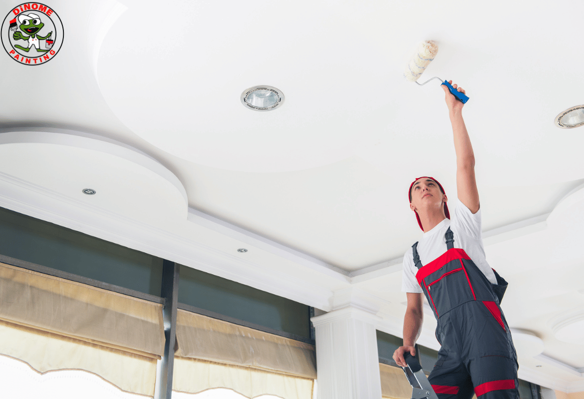
Execution: Getting a Professional Look
Once you have selected your color, the work moves from the mind to the hands. If the task seems daunting, many homeowners choose to hire a professional Exterior Painter Company Southampton NY that also specializes in high-end interior finishes. Professional painters have the equipment and the “eye” to ensure that the transition between the wall and the ceiling the “cut-in” line is razor-sharp.
However, if you are tackling this as a DIY project, there are a few steps you cannot skip. Preparing Your Home for Professional Painters (or for yourself) is the most critical stage. This involves:
- Clearing the Room: Remove all small items and move heavy furniture to the center of the room.
- Dusting: Ceilings collect more dust and cobwebs than we realize. A clean surface is required for paint adhesion.
- Masking: Use high-quality painter’s tape to protect your crown molding or the tops of your walls.
- Drop Cloths: Paint drips are inevitable when working overhead. Cover every inch of your flooring with canvas drop cloths.
Final Thoughts
The ceiling is a missing opportunity in many homes. By moving away from the “default white” and considering the height, light, and architecture of your room, you can elevate your interior design to a professional level. Whether you want a room that feels like a sun-drenched sky or a moody, sophisticated sanctuary, it all starts with looking up.
Take your time, test your swatches, and don’t be afraid to add a little color to your fifth wall. The results are often the most rewarding part of any home renovation.