Hallway Paint Ideas for the Modern New York Home
In a city where every square foot is premium, New Yorkers have become masters of maximizing space. We obsess over our living room layouts, agonize over kitchen cabinetry, and curate our bedrooms like sanctuaries. But there is one area that consistently gets the “afterthought” treatment: the hallway.
In NYC apartments whether it’s a pre-war classic on the Upper West Side or a narrow railroad flat in Brooklyn the hallway is often a dark, windowless passage that serves only to get you from Point A to Point B. However, recent design shifts in 2024 and 2025 are changing the narrative. Interior designers across Manhattan are no longer viewing the hallway as a “connector”; they are viewing it as a “canvas.”
If you’re looking to refresh your home, here is a deep dive into hallway paint strategies that combine timeless advice with the latest trends hitting the New York design scene.
1. The Death of “Rental Beige” (and the Rise of the New Neutral)
For decades, the default for New York hallways was a generic, safe beige. It was meant to be inoffensive, but in the low-light environment of a long corridor, it often ended up looking muddy or dingy.
Today, we are seeing a shift toward “The New Neutrals.” Instead of flat beige, homeowners are opting for Greige (a mix of gray and beige) or Soft Mushroom tones. A color like Sherwin-Williams Accessible Beige or Repose Gray provides enough warmth to feel cozy but enough “cool” to keep the space looking modern.
Pro Tip: In narrow NYC hallways, try the “Envelope Method.” Paint the walls, baseboards, and even the ceiling in the same neutral shade. This removes the visual “breaks” in the room, tricking the eye into thinking the space is wider and more continuous than it is.
2. Making a Statement with “Jewel-Box” Foyers
One of the hottest trends in Brooklyn brownstones right now is the Jewel-Box Entryway. The logic is simple: since you don’t spend hours sitting in a hallway, you can afford to be much bolder than you would be in the living room.
Deep, saturated jewel tones like Emerald Green, Sapphire Blue, and even Deep Amethyst are making a huge comeback. Sherwin-Williams Cascades (a dark, moody teal) is a frequent favorite for creating a sense of immediate luxury the moment you walk through the door.
Why does this work? In a city that is often gray and concrete, walking into a home with a rich, colorful entry provides an instant emotional lift. It signals that you’ve left the chaos of the subway behind and entered a curated, private world.
3. Solving the “No Window” Problem
Most New York hallways are notoriously dark. If you aren’t ready to go dark and moody, you need to lean into light-reflective technology.
While “White” seems like the obvious choice, the wrong white can look like a cold hospital wing. Designers are now leaning toward Museum Whites crisp, clean whites with just a hint of warmth that mimics the feel of an art gallery. Sherwin-Williams Extra White is a staple here because it lacks the yellow undertones that can make a hallway feel dated.
To take it a step further, consider the finish. While the blog post suggests Satin or Semi-Gloss for durability (which is essential for those of us bumping strollers and grocery bags against the walls), a High-Gloss ceiling is the ultimate New York “flex.” A lacquered, high-gloss white ceiling reflects the light from your light fixtures back down, effectively doubling the brightness of the space.
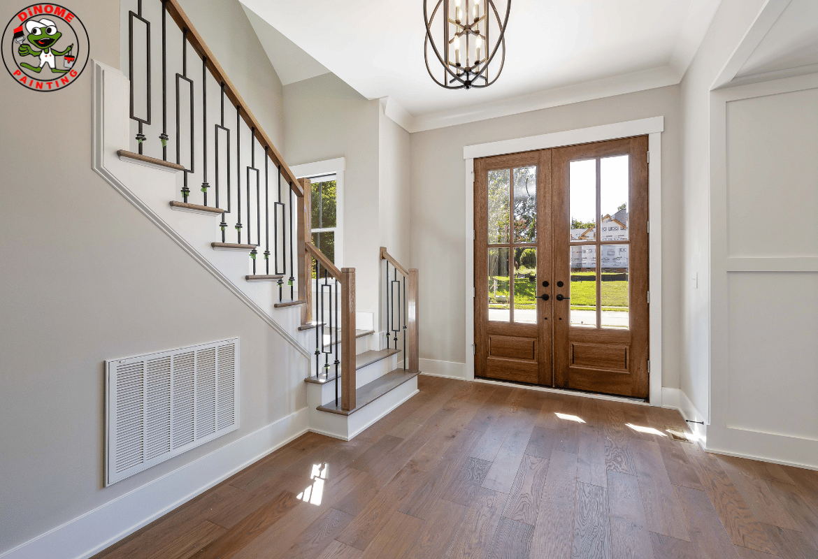
4. Embracing Architectural History
If you’re lucky enough to live in a pre-war building with original moldings, wainscoting, or picture frames, your paint job should be about highlighting, not hiding.
The “Wainscoting Wonderland” approach is a classic for a reason. By painting the lower half of the wall in a durable, bright white and the top half in a sophisticated tone like Silvermist (a soft, silvery blue green), you add a layer of architectural depth. It makes a narrow space feel intentional and historic rather than cramped.
In Mid-Century Modern apartments think those iconic buildings in Greenwich Village the trend is to let the wood do the talking. If you have original wood trim, avoid painting over it. Instead, use a “warm neutral” like Balanced Beige to complement the amber tones of the wood, creating a cohesive, “Mad Men” era aesthetic.
5. The Hallway as a “Mood Transition”
Life in New York is all about transitions. We transition from the street to the lobby, the elevator to the apartment. Your hallway should serve as a transition between the different “modes” of your home.
If your living room is a bright, high-energy space where you entertain, consider painting the hallway leading to the bedrooms a Pale, Watery Blue (like Resolute Blue). This creates a psychological “cool down” period. As you walk from the social area to the private area, the color shift tells your brain it’s time to relax.
6. Practicality: High-Traffic Reality
Let’s be honest: New York hallways work harder than any other part of the home. They are the landing zones for muddy boots, the “track” for kids running back and forth, and the narrow passage where furniture inevitably gets moved.
Recent updates in paint technology mean you don’t have to sacrifice style for durability. Scuff-resistant finishes are now a must-have. When selecting your paint, look for “Satin” or “Semi-Gloss” for the walls. These finishes have a slight sheen that allows you to wipe away fingerprints and scuffs with a damp cloth without removing the paint itself.
7. Lighting: The Secret Ingredient
No amount of expensive paint can save a hallway with bad lighting. In New York, where we often rely on overhead “boob lights” provided by landlords, the first step to a better hallway is changing the bulbs.
- Warm Bulbs (2700K): Best for warm neutrals and deep reds/browns.
- Cool/Daylight Bulbs (3000K-3500K): Best for blues, greens, and crisp whites.
If you’ve painted your hallway a moody charcoal like Turkish Coffee, add wall sconces. They create “pools” of light that add drama and prevent the dark color from feeling like a cave.
8. The “Gallery” Trend
Finally, we are seeing a massive surge in the “Hallway Gallery” style in Soho and Chelsea lofts. This involves painting the hallway a stark, bright white and using it exclusively to display art.
If you go this route, the paint needs to be flawless. This is where professional techniques like skim coating and drywall repair become essential. In an art-gallery hallway, every bump and crack is visible. A professional “Level 5” finish (perfectly smooth) combined with high-quality white paint like Ceiling Bright White turns your hallway into a professional-grade exhibit space.
Conclusion: Every Step Counts
Your hallway is the “connective tissue” of your life. It is the first thing you see when you come home and the last thing you see when you leave. In 2025, the trend is about making those steps count.
Whether you go for a bold, navy blue “statement” foyer or a serene, museum-white corridor, remember that your hallway has the power to set the tone for your entire home. Don’t settle for “fine.” Choose a color that makes you feel like you’ve finally arrived home, the second you turn the key.
Ready to transform your NYC hallway? From the initial color consultation to the final brushstroke, choosing the right professional can make all the difference. Get a quote today and give your “in-between” space the glow-up it deserves.